
The rumour of a flat design in the latest version of Apple’s iOs7 have become to strong to ignore any longer. We already know that Apple is up to something big at this years WWDC, and we’ve seen some very needed additional features that we may expect in iOs7. But what about the actual design, the look and feel of iOs7 itself?
Two words: Flat Design.
Apple’s ability to design simplistic yet aesthetically beautiful UI software has always been what set them apart from the rest. They basically led the foundation for mobile interactions with software. Even if only for a year or so, still. They where the pioneers at a stage, and they did a pretty darn great job of it.
This is why a radical change such as redesigning iOs7 to incorporate flat designs is so important.
The below image leaked that shows the apparent flat design. Good luck in figuring that out, it’s pretty undecipherable to us.

Photo: Courtesy / SonnyDickson.com
Sonny Dickson allegedly running iOS 7 on an iPhone 5. While the photo is blurry, the app icons look subtly different
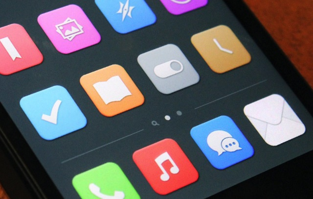
Photo: Courtesy / Surenix
Graphic designer Surenix was able to recreate some of the icons shown from the blurry photo taken by Sonny Dickson, which shows how the colors in iOS 7 are much flatter and lack the reflection effect.
Apple’s ability to keep things simple and efficient is another trademark, yet recent opinions have been that this rigid simplicity has lead to some limitations. There are times where users could do with a bit more complexity. A good example is the photos app; even though this is beautiful and simple, we need more options, organizations and added features such as easier browsing and searching.
We can only hope that what we get come WWDC is not a Microsoft-tiles-sharp-edges-copy or a Android-big-clunky-visible look and feel. We want to be surprised, we want to be blown away. We want to see it and say “This is why I love Apple“.
[Source]


Trackbacks/Pingbacks