
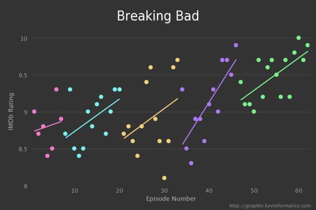
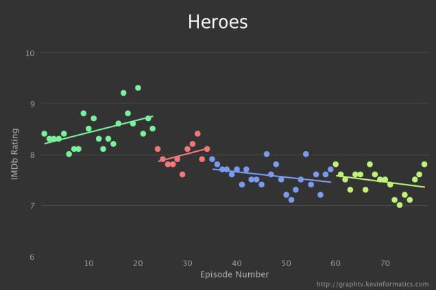
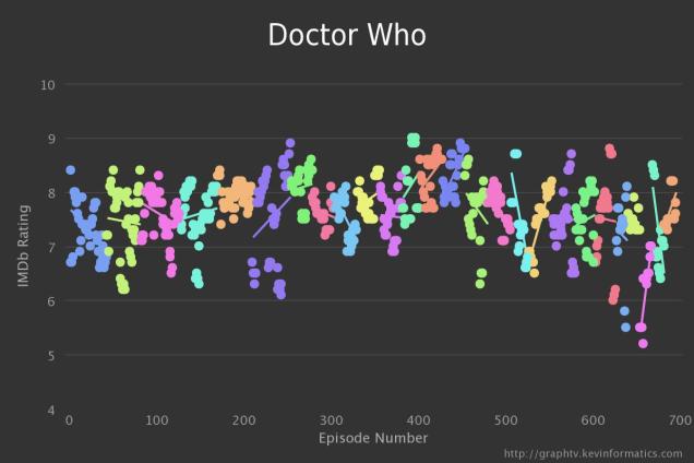
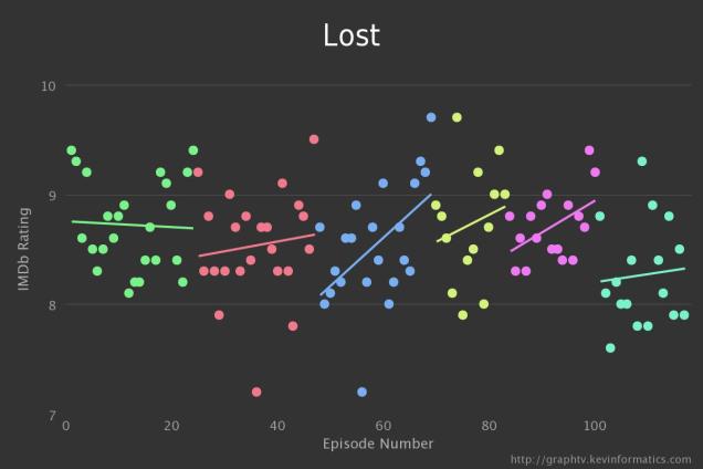
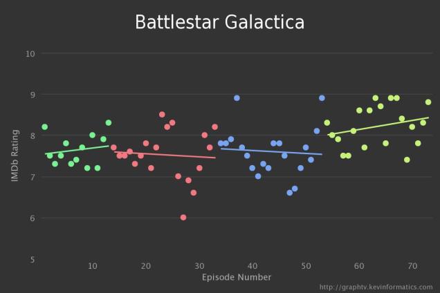
We featured 5 Tv shows you forced yourself to watch to the end a while ago, and briefly showed when these once great shows started to decline in their ability to carry the show forward, and where they picked up once again making it a show worth watching again.
The guys at GraphTV took this one step further by generating these insanely detailed graphical images that show exactly when your favourite show started to move up or down in IMDB rankings.
We’ve mentioned a few below, but head over the GraphTV and check-out how your favourite show performed.
[Source]